If we must compose a photograph, we should control the components. But look how many components we can have in a photograph!:
- Objects
- Spaces
- Textures
- Color
- Shadows
- Light
- Objects in movement
- The horizon line
- Perspective
- ...
And many more! From this springs the first rule: Less Is More
Even the best photographer has problems controlling so many factors. As a result it’s necessary to try to simplify the photographs we take to the fewest components possible. And we have to be bold to do it.
Later on, when you have a lot of practice and you are an expert, you can venture to take more complex photos, but even then you will see how the purity of your message lies in simplicity.
Once I read in a book that the difference between painting and photography is that in painting we have a blank canvas where we have to include elements in the composition; whereas in photography we have the whole world from which we must take away elements in order to compose. So true. Consequently, when composing a photo, as far as possible we must make an effort to eliminate that which we doubt has special significance. If we don’t do it we run the risk that the photo we are taking will be confusing and mediocre.
Example 1 Less Is More

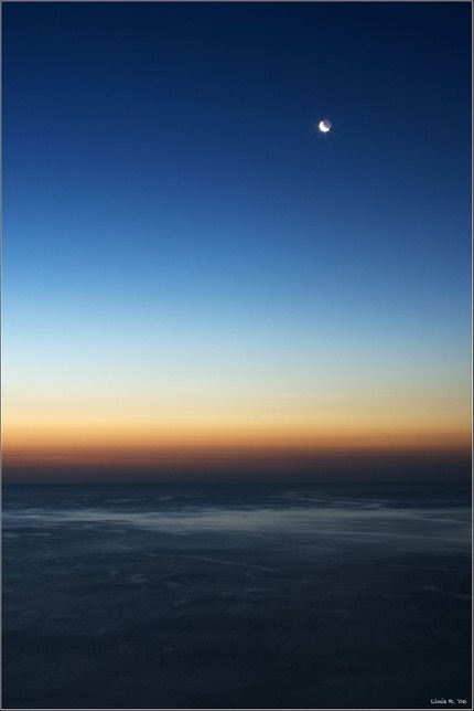
"Amor de lluna", Tarragona (2006)
Look at this photo of daybreak from a balcony in Tarragona in the Mediterranean. Only the moon, the sky, and the sea. These subjects, along with the color and a touch of long exposure, create a simple and beautiful photo, and definitely express loneliness. We didn’t require any more factors.
Example 2 Less Is More
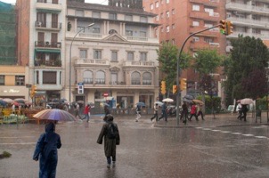
Another example of less is more and how to “paint” in photography. In this case we have a rainy day in the city of Barcelona in May of 2008.
In the following photo that I took we can see the street of Vía Augusta in Barcelona, with buildings, people crossing the crosswalk, the traffic lights, a bit of sky above the roofs, two people in the foreground, and the water swirling on the asphalt. I definitely included a lot of elements and the photo turned out a little confusing and rather uninteresting:

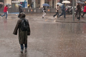
Doing an exercise of elimination for this tutorial, I cropped it in the lab, eliminating the buildings, traffic lights, one of the people in the foreground, among other things. The result you can see below:

Notice that the photo continues to tell us about the principle subject: the rain. And it’s very possible that this theme stands out more because there are fewer factors that distract us. This boy in the middle of the street stands out, making us remember moments when we have been caught out in the rain and we have just had to carry on and get soaking wet.
