Color is another very important attribute of photography to keep in mind when we take a photo. Will the photo be in black and white? In color? The fact is we could do a whole new tutorial filled with pages on this subject. But here I’m only going to expand on an initial idea that will help us decide.
I refer now to the Rule of Less Is More. Photography is above all light, light and shadow, such that a photograph in black and white can perfectly well tell us about our theme. If that’s the case, then why take it in color? Color is just another factor in photography and if it doesn’t bring anything to the photo we should avoid it; remember that less is more. In these instances color would just distract us.
For this reason a good black-and-white photograph is powerful next to many color photographs. It is intense, simple in its composition, without devices that obscure the power of the light.
Certainly, in many kinds of photography color is essential. In fashion photography, industrial photography and other fields, color is vital because it more closely approximates the reality of the subject.
Another example of the use of color is when we are trying to express information about warmth or coolness in a photograph. In a photo where reds, oranges and yellows predominate, we are expressing warmth. On the other hand, a photo with blues and purples will convey coolness. This tonality can be adjusted in a photo with color temperature or using color filters.
It is important to think, before taking a photograph, if we will use the feature of color or not, for various reasons. The first is that if we decide that we’re going to take a photograph in black-and-white we have to compose, more than anything, the light and shadow. This will be our language and we will have to remove color from our image. The second reason, which really affects those who use analog cameras, is that it is advisable to use special black-and-white film, so we will have to think before leaving home if we are going to take black-and-white or color photos. This doesn’t happen as much with digital cameras. Actually it’s recommendable that if you want to take black-and-white photos in digital format, you should take them in color. Later on in the lab, with software, you can change them into black-and-white. This way we can maintain the tones of the photograph and fine-tune the black-and-white more precisely in the lab.
Example 1 Black and White
The national park in Bardenas, in Navarra. During this enjoyable trip I was able to discover this amazing landscape which is only a few hours away from my house by car. It’s a desert landscape where the predominant color is brown. But what really got my attention were the mountains and the rocks that draw contrasts, patterns and whimsical lines. For that reason, out of the following two photos of the mountain, I chose to keep the black-and-white one, because color doesn’t add any relevant information about what it is that moves me about this landscape.
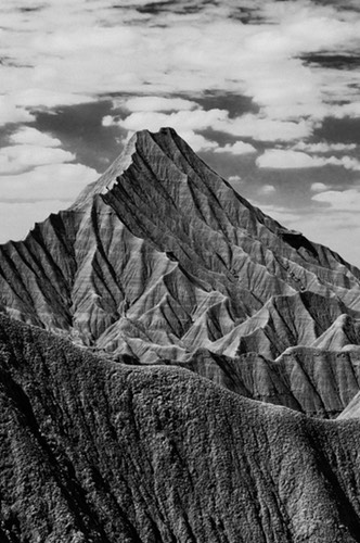
"Bardenas", Las Bardenas Reales (2010)

Example 1 Color
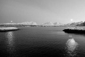
Several degrees below zero, the midday light begins to disappear in the arctic winter, but the warmth of the light from a pair of lampposts floods out, despite being separated by a canal. Without a doubt, the color in this photograph is important for perceiving it that way. On one hand the blue dominates the cold landscape, and on the other the orange of the light brings warmth. Notice how in the black and white version such important information is lost.
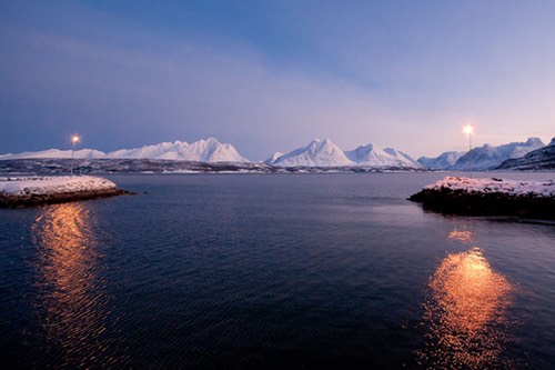
"Distàncies", Breidvik (2010)